
The topic Chrome for Android gets Material 3 Expressive Settings is currently the subject of lively discussion — readers and analysts are keeping a close eye on developments.
This is taking place in a dynamic environment: companies’ decisions and competitors’ reactions can quickly change the picture.
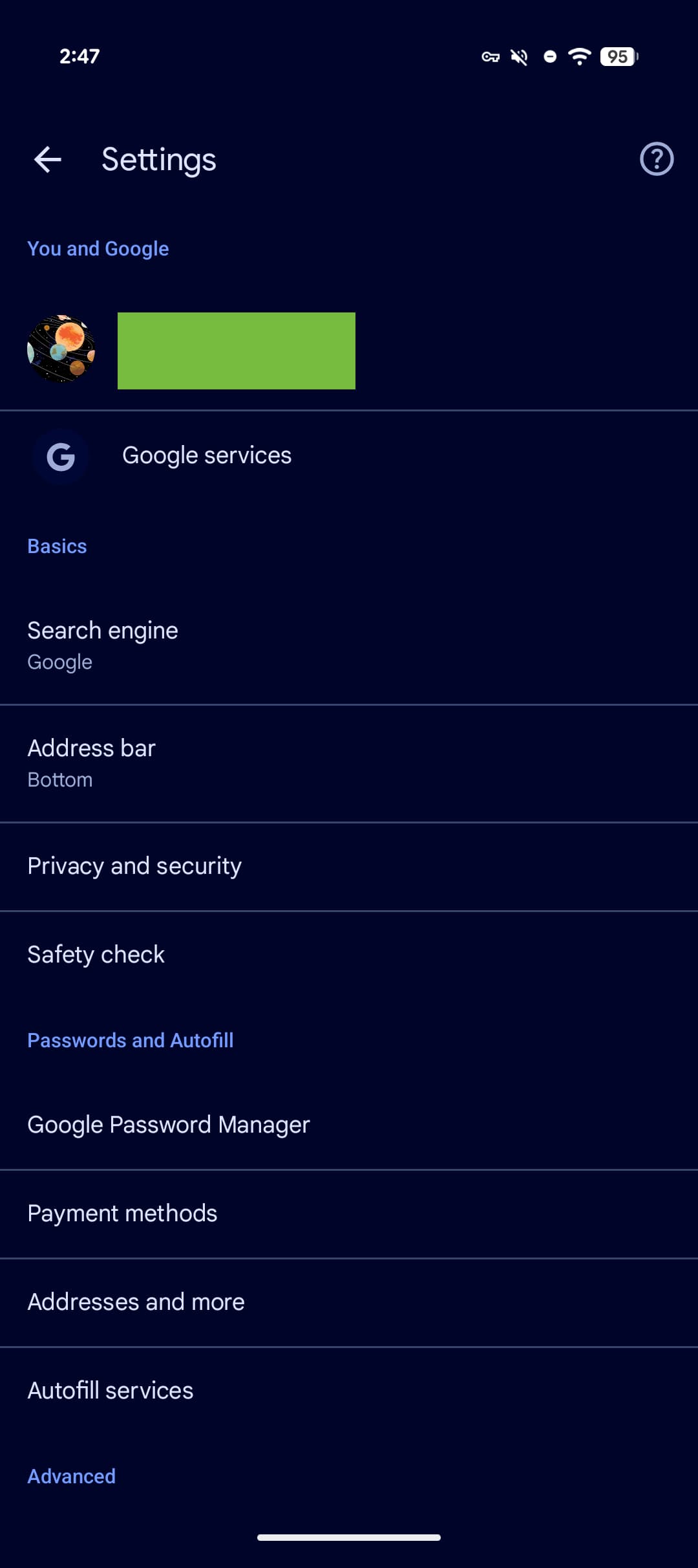
Google is giving Chrome for Android more Material 3 Expressive with a redesign of the Settings page.
Every line is now placed in cards that are separated from one another. The container doesn’t span the full width of the screen with padding at the left and right, while the first and last cards of each section feature more pronounced corners. Each container is lighter than the page background, which also now uses a much lighter Dynamic Color shade.
Compared to the previous design of placing text with line dividers, the gaps between each section improve glanceability quite a bit.
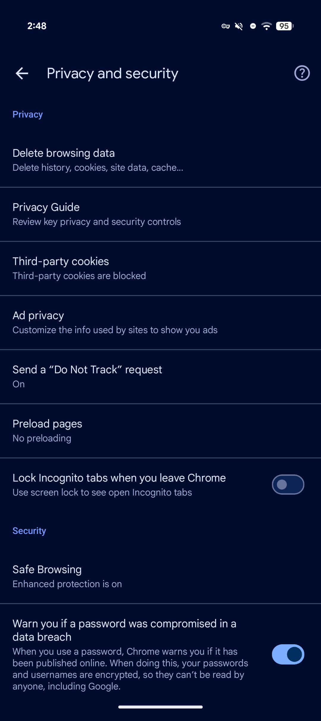
This style also applies as you open menus, though there are no changes to on/off toggles. Chrome continues to use smaller switches than the rest of Android. Otherwise, this update now aligns with Android’s Settings app.
These visual tweaks are rolling out as a server-side update with Chrome 146. Force stop Chrome from the App info menu if you’re not seeing the revamp yet.
This touch of Material 3 Expressive joins the updates introduced last fall for the address bar, three-dot overflow menu, and Tab Grid.